For my first assignment I chose a porcelain tea set that I inherited from my partner's grandmother who passed away five years ago. She was a truly lovely and kind lady, always making me feel welcome whenever I visited her. She had worked hard throughout her life and liked the best of everything; her house was always immaculate but also full of fun and laughter as she'd hold dinner parties and family gatherings on a regular basis. The tea set is being kept in a glass cabinet in the dining room and whenever I look at it, it often reminds me of all the great memories I have of Betty. Therefore, when it came to drawing it, I wanted it to be portrayed in soft, delicate tones in an attempt to re-capture some of those lovely past memories which are reminiscent of her gentleness, kindness as well as good taste!
As there were numerous pieces that belonged to the tea set, I confined myself with just a few items. Initially, I played with different arrangements while at the same time taking photographs as I was going along. Having decided on some of the compositions that I thought would work best, I referred back to my photos and proceeded in setting those up again. I did small, rough sketches in my sketchbook to get an idea as to what they would like on paper.


Reference photos of compositions that I thought may be interesting.
The one at the bottom is the one I decided to go with in the end as it seemed to 'flow'
better than the rest.


Below you can see my preliminary sketches of the various compositions before deciding on the best one.


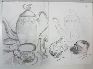
I selected a few mediums that I thought would be most appropriate for my drawing, in terms of capturing mood and feelings; pencils, (various grades), willow charcoal, (so I could build up deeper layers of shading), water soluble pencils, ink, a sepia soft pastel and also some oil pastels. Hopefully they would be enough to help me decide!
I used A3 mixed media paper, 220 gsm, divided in two and drew the teapot side by side to help me make comparisons of my chosen mediums. My first try on the left was with water soluble pencils enhanced with a bit of watercolour, (ivory black and paynes grey) and some of the details in ink pen. The tones on the right were made with watercolour, charcoal and ink pen to accentuate some of the shading details, (working with media other than pencils, charcoal and graphite is a fairly new experience for me).

I then tried water soluble ink, (bottom left), and I really liked some of the effects of the ink as it got watered down. However, I am not very confident with using ink yet so that I knew that it was not going to be my preferred medium as it would be too high a risk to take!

I then tried water soluble ink, (bottom left), and I really liked some of the effects of the ink as it got watered down. However, I am not very confident with using ink yet so that I knew that it was not going to be my preferred medium as it would be too high a risk to take!
The oil pastel colours, (bottom right), provided an interesting texture, the reason I chose those colours was because I thought they would work together and give the tea set an 'old' yet 'vibrant' feel. I tried blending the colours using a cotton bud dipped in a paint solvent as the crayon layers were too thick in places. The darker lines were made using a soft, water soluble pencil.
In all of experimental drawings I enjoyed mixing my mediums and could see how they could enhance what I was trying to sketch as each offered a different element and feel to my selected object.

I think my two favourite sketches of the teapot are the ones that incorporate in colour as they make
the teapot come to life!
So... back to my chosen composition now and time to start drawing!!
My light source was natural light from a window to my right. I placed a white card behind the tea set to block the busy background of my kitchen area; I wanted my complete focus to be the tea set itself. Because my objects, foreground as well as background were all pale, I edited the photo I had taken to black and white so that some of shadows would become more obvious. Drawing my white items on white paper would be a challenge and the only thing that would make them 'pop out' would be tonal gradations to suggest depth and perspective.
In my mind's eye, I knew that I wanted the tea set to look 'clean', with 'crisp' white contrasts and to have subtle changes of tonal variations. I wanted to achieve an overall 'neat' effect, a bit like Betty's immaculate household. Furthermore, I wanted to evoke a feeling of nostalgia therefore my shading would have to be soft and not too dark to successfully encapsulate those happy and wonderful memories.
I drew my objects freehand on A2 cartridge paper 220 gsm. Once I had laid down the first couple of layers of shading I knew I had to be careful as I didn't want to overpower my drawing with very deep, dark shades that would detract from the softness I wanted to achieve. Having reached a satisfactory stage where all the items had been drawn on paper, I tried to incorporate a bit of frotage to see if by adding texture my drawing would be enhanced. I used a soft mesh material and charcoal to take a rubbing but hardly anything came through as the paper was too thick and heavy. I then decided to use the willow charcoal to darken my whole background and although the tea set stood out a bit more visually due to the contrast between light and dark, it just didn't look or feel right to me.
I used a kneaded eraser to remove any unwanted marks and excess charcoal and I carried on blending my background with the eraser that seemed to add a slight texture. I finished with a couple of more layers of shading to the left of the tea set using a soft black pastel. With a small paintbrush dipped lightly in water soluble oil colour, I darkened the small dark decorative patterns and with a fine tipped pen I outlined all the details around them.
 |
| Stage 1. Not sure if this was visually exciting enough! Maybe a bit too flat, pale and lacking depth. |
 |
| Stage 2. Having played with frotage and deciding to go darker. However, not creating the light, soft image I wanted to portray. |
 |
| Final drawing, hopefully the right balance between light and dark! |
Reflections:
By looking at my final drawing I think it lost some of its softness and vibrancy and felt a bit 'overworked'. In hindsight, I should have experimented more with my options for the background shading before committing to it on my final drawing. Or perhaps used a pale coloured paper! Sometimes it's hard to know when to stop working a picture and it's easy to get carried away by adding more and more mediums and eventually lose the right balance.
Drawing freehand also meant that my teapot was more elongated than the one in the photo and some of the decorative details were also a bit wrong. Perhaps I should have chosen to draw my picture in landscape! However, although the proportions were slightly 'out', I enjoyed the challenge, quirkiness and 'looseness' of freehand drawing!
I am pleased with how I managed to place my composition fairly centrally on the paper, something I seemed to be getting wrong during the earlier exercises. (I am more used to carefully planning where my drawings sit on paper and often use grids to enlarge my work).
Overall, I think the composition is pleasing as it tends to 'flow', drawing the eye to the teapot and then going round clockwise. In terms of shading I used hatching, contour shading, smudging and some cross hatching, but that's not clearly visible as I used a very fine pencil and the overall effect is more 'smudged' than defined with lines. Where appropriate, I used a darker pencil, pastel or charcoal to define some of the darker areas by going over them a few times and alternating the pressure that I used.
While the use of an actual tea set by people is not as common as it used to be, I would like to think that the viewer may feel a bit nostalgic but also wonder about who this tea set belonged to. I hope that I have managed to capture the right mood and portray the tea set in a way that reflects looking into and reminisce about the past.
While the use of an actual tea set by people is not as common as it used to be, I would like to think that the viewer may feel a bit nostalgic but also wonder about who this tea set belonged to. I hope that I have managed to capture the right mood and portray the tea set in a way that reflects looking into and reminisce about the past.
I found it quite challenging taking clear photos of my assignment and I don't think my photos represent my drawings very accurately. This may be due to the fact that the work for my assignment wasn't dark enough, ( I noticed that some of my photos from previous exercises came out better as they were a lot darker in value). I tried to follow hints and tips from the web including OCA's advice as to how to photograph art but I couldn't get the result. So I guess I need a bit more practice in this area!
Assessment criteria
Demonstration of technical and visual skills-materials, techniques, observational skills, visual awareness, design and compositional skills.
During the assignment, I was aware that I had to follow a brief and amalgamate some of the techniques and methods I had learned so far.
I drew my composition free-hand and managed to position my drawing fairly centrally to the paper, something I need to exercise more, as I often rely on the use of rulers, grids and pre-measuring spaces, gaps etc... So, I would like to draw more free-hand from now on and 'loosen up' my style!
I drew my composition free-hand and managed to position my drawing fairly centrally to the paper, something I need to exercise more, as I often rely on the use of rulers, grids and pre-measuring spaces, gaps etc... So, I would like to draw more free-hand from now on and 'loosen up' my style!
I believe, I included most of the finer details, all be it some of them slightly out of shape and proportion! When I showed my drawing to other family members they immediately recognised the tea set and gave me positive feedback.
I think that my chosen composition works as there is a balance of positive and negative space and the viewers eye is guided in a circular motion.
Quality of outcome-content, application of knowledge, presentation of work in a coherent manner, discernment, conceptualisation of thoughts, communication of ideas.
I do not know if I am completely happy with the end result. Having to follow a certain brief has meant that every time I'd go back to my drawing and question myself as to whether or not I was fulfilling the right criteria and kept changing things! This could also be attributed to the fact that after visiting some other student's work on their blogs, my view of what was expected of me kept being swayed.
I incorporated some of the shading/light techniques that I learnt within this part of the course such as: hatching, contour shading and light/reflections. I deliberately left out the printed detail of my tablecloth as I wanted to focus on the tea set itself.
I often struggle with words, (writing has never been one of my strengths), and over the years I have come to realize that I am a visual learner. However, I would like to think that I have managed to represent my ideas and thoughts in a clear, coherent manner and where appropriate I have included photos to help substantiate my points.
Demonstration of creativity-imagination, experimentation, invention, development of a personal voice.
I love using a camera, (mobile phone one or DSLR) to take photos while playing with compositions, be it of objects, landscapes or portraits. I like to go over each one of my photos and evaluate the visual impact or mood that comes through them. I then crop them and create new photographs by enlarging them and shifting the focus. I toyed with the idea of using this method for my tea set as seen in the example of my first compositional photograph and pay more attention to the tea pot itself but in the end decided against it.
As I knew it would take me some time to complete my drawing, I started drawing from life and then used my reference photograph. One can only monopolize the dining table for limited periods of time and when it starts to get dark as early as it does nowadays, it's challenging maintaining the same light source continuously!
In terms of experimentation, I feel that I used a good range of materials for my preliminary drawings to compare their various effects on paper and how each would affect the mood of my drawing. I am more used to drawing with limited materials such as pencils, graphite and charcoal, so putting ideas to practice while utilizing new materials was a new challenge for me. I know that this will become easier the more I practice!
I guess the development of an artist's personal voice not only arises through the use of chosen mediums but also by the way compositions are put together, choice of colour schemes and items/locations/subjects chosen. It's hard for me to pinpoint my style/personal voice presently as I am only just beginning to learn about a whole range of new techniques and artists.
I guess the development of an artist's personal voice not only arises through the use of chosen mediums but also by the way compositions are put together, choice of colour schemes and items/locations/subjects chosen. It's hard for me to pinpoint my style/personal voice presently as I am only just beginning to learn about a whole range of new techniques and artists.
Up to this point, when it comes to drawing my passion has been creating portraits of family and friends as well as pets, using monochromatic schemes. It will be interesting to see how I develop my style over the course of the next few months and how I incorporate new ideas and methods in my drawings.
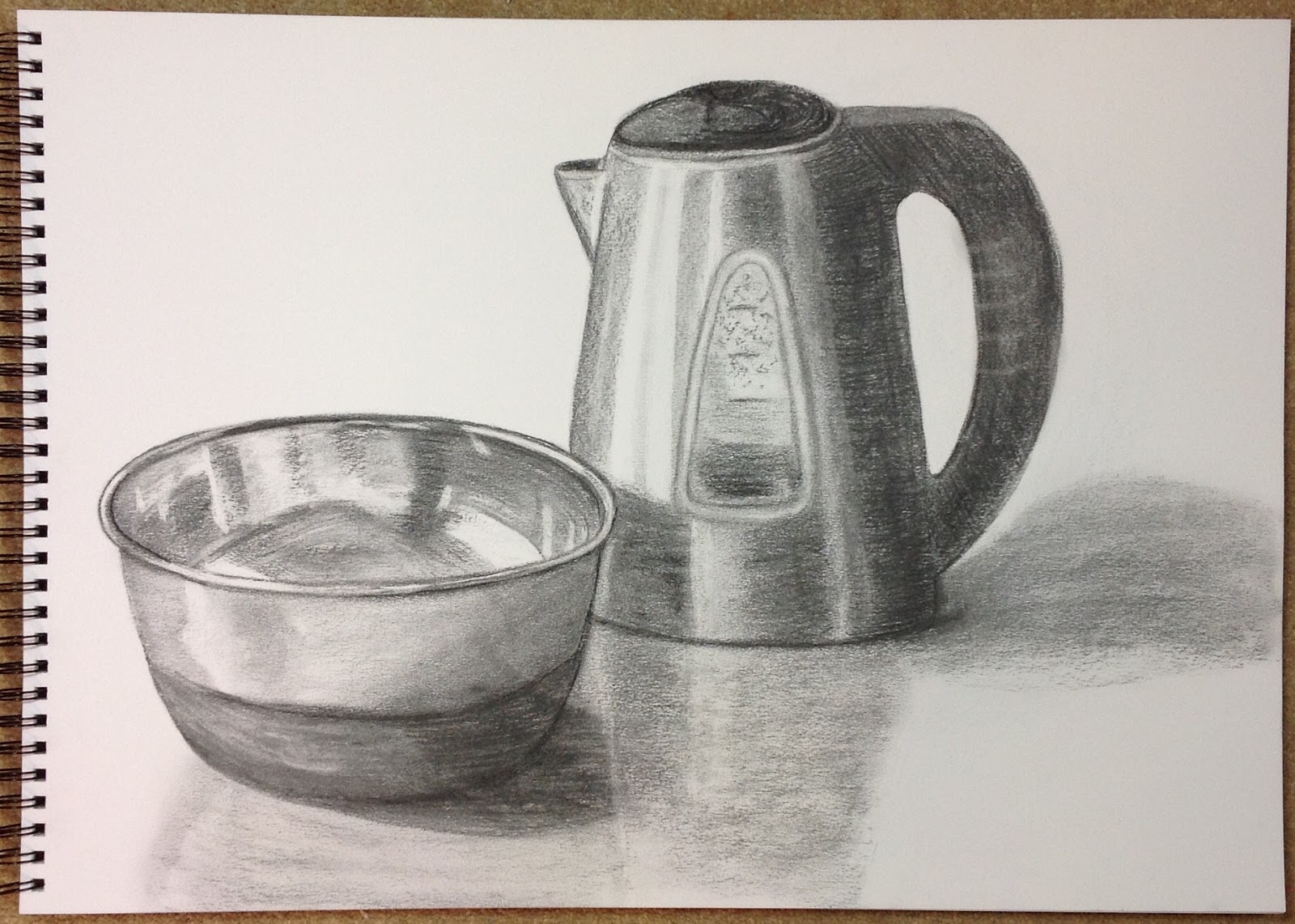
When I had nearly finished my assignment, I drew the same tea set composition on heavier paper using mixed media. The final product looked a bit more like a collage but the randomness of colours and shapes was quite pleasing, (I have included a photo of it on my blog pages). I just had to see what it would like if I had chosen colour!!
Context reflection-research, critical thinking (learning log and at, second and third level, critical views and essays.
Before starting my drawing I did a bit of research on still life artists on the internet. I came across the works of Giorgio Morandi and I really liked his compositions which were simple yet effective in capturing the audience. I particularly liked his arrangements and placement of objects; I felt curious as to what was hidden in the back before focusing on the objects in the front while simultaneously following their varying heights and outlines! I do wonder whether his chosen items were just every day objects or they meant something to him!
When comparing Morandi's monochromatic works to those of Redon, Morandin's shading is done mostly by hatching/cross hatching and his tone is subtle. When it comes to paintings again Morandi's use of colours and tone are muted and pale in comparison. The overall atmosphere created: soft and calm, a bit like what I wanted my drawing's feel to be.
Having looked at the works of Max Ernst I have come to realize how frotage can create stunning effects and texture that would otherwise be very laborious to draw single handed. Although I did experiment with the concept I didn't use my imagination enough in incorporating this technique effectively in my drawing, mainly due to my lack of confidence and experience not to add the time constraints!
While researching Odilon Redon, I couldn't help but fall in love with his work, his brilliant use of contrast between light and dark not only in his noirs but also in his coloured paintings. This use of contrast not only serves to give a three dimensional effect to the drawing but also allows the viewer to get a glimpse of the artist's mood and some of the feelings he is trying to get across. The overall effect: enigmatic and mysterious. As Odilon Redon stated: "The artist yields often to the stimuli of materials that will transmit his spirit.".
While drawing Betty's tea set, I carefully considered the type of mood I wanted to create and tried to match it to the mediums I had access to. I went from light to darker then lighter in an attempt to see what best suited the mood I was trying to capture and recreate. I don't think going really dark with my background or shadows would have suited my drawing, as I would associate those values with feelings other than the ones I wanted to portray.
I hope that my drawing of Betty's tea set reflects some of the influences and processes I followed from this part of the course and that my blog contains all the necessary information to help support my course work!


