Search This Blog

Wednesday, 12 October 2016

!! Research Point!! Odilon Redon

Odilon Redon (1840-1916)

A little bit about his life...

Odilon Redon was a keen artist from a very young age. He studied art formally at the age of fifteen but because of his father's influence he moved over to architecture. After his failure in studying the latter subject, he took up painting, sculpture, etching and lithography.

Having served in the army in 1890 during the Franco-Prussian war, he then turned his attention to working with charcoal and lithography and called his visionary works 'noirs'. After that period he started using pastels and oils and took an interest in Hinduism and Buddhism, hence the presence of Buddha in some of his works.

Redon used oiled charcoal extensively as it was easier to be worked into the paper than ordinary charcoal as it turns to powder. Over time as the oil gets absorbed by the paper it exhibits an overall brown tone. Charcoal can be identified in his noirs by its warmer, black, brown tone.

He didn't start using colour till he was in his 50s. In his earlier pastels he applied colour over charcoal underdrawings, combining pastel, guache and pastes made form crushed pastel mixed with water and applied with a brush. Occasionally he would take a noir produced years earlier and rework it, obscuring much of the noir beneath the pastel.

In preparation for his drawing....... Redon would prepare the paper with an overall base of powdered charcoal. As he built his compositions with layers of media, he intermittently fixed the surface and again subtracted media from it. Before the spray could dry he reworked the damp charcoal surface with his fingers and removed charcoal, or indeed his fingernail to create texture.....
In 1900 he was commissioned by Baron Domecy to create 17 panels for the dining room of the Chateu de Domecy sur le vault. He moved on from ornamental to abstracts and the colours that he used mostly were yellow, grey, brown and light blue. In 1903, he was awarded the Legion of Honour.
During Odilon Redon's early years, his works were described as ' a synthesis of nightmares and dreams'. His paintings incorporated dark, fantastical figures from his imagination, exploring his own internal feelings and psyche.

He wanted to place 'the logic of the visible at the service of the invisible'. His charcoal sketches delved in deep into the terrors of fever ridden dreams. Redon describes his works as ambiguous and undefinable. 'My drawings are to inspire and not to be defined. They place us, as does music, in the ambiguous realm of the undetermined'.


source: www.odilon-redon.org/biography.html

Tuesday, 11 October 2016

Project 2 - Exercise 4 Shadows and reflected light

Exercise 4 - Shadows and reflected light

As a warm up, I sketched a ceramic salt pot and a small metallic pan. I used charcoal to sketch the image freehand. It was fairly tricky depicting the materials the items were made of. With a kneaded eraser I lifted some shaded areas to create the impression of reflected light.
When it came to metal pan, I used less pressure to create the lighter tones and reflections. Although my composition is fairly central to the paper, I am not sure it works as I may have drawn the objects too small. Or it may be the lack of foreground and background shadows and  too much negative space?

A3 warm up, using charcoal and putty


Second try at playing with shadows and reflected light

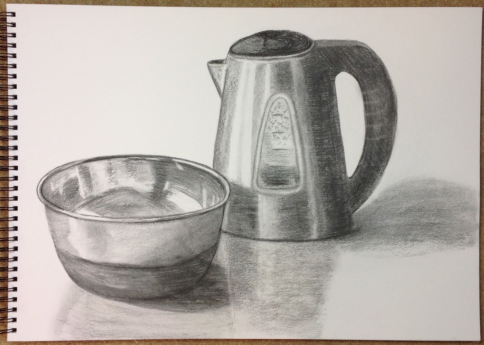
This time I tried an arrangement of two metallic objects, much larger in size, hoping that they would better fill the surface of the A3 paper.
My selected objects
Having sketched their outlines with charcoal, I was pleased with the space now occupied on the paper. I refined some of the lines, (the rim of the bowl was slightly out of shape) and added extra details, (the window of the kettle and lines around the lid). I then added more and more layers of shadowing by placing the charcoal on its side and adding more pressure. When I felt the shadowing was adequate, I used the charcoal tip to define some of the darker, finer lines The putty was useful in lifting some of the charcoal marks and lightening areas that I had made too dark.

Originally I was going to add the faint shadow of the kettle handle on the background but then decided against it as there is no shadow being projected on the background by the metallic bowl. Instead, I just concentrated on the shadows cast on the table.

I had to fix my sketch when I got to that point and add more layers of charcoal to achieve darker values where needed.

Once I finished my sketch, I thought it looked better from the distance than close up!! I am fairly pleased with the end result and also remembered not to 'box in' my shadows, instead I just sketched them freely in.

A3 composition with a focus on shadows and reflected light


Monday, 10 October 2016

Project 2 - Exercise 3 Creating shadow using lines and marks

 Exercise 3-Creating shadow using lines and marks.

Single object
I chose a small cardboard box and used four different drawing tools to help me create shadows using lines and marks; a pencil, a biro pen, a felt tip pen with a fine nib and a wider tip alcohol marker. I used a lamp to help create a prominent shadow. 

pencil (top) and biro (bottom)
fine felt tip (top) and broad marker (bottom)


Reflections on using my chosen mediums :

Pencil
I really enjoyed using the pencil as it's what I am mostly used to, (it was hard to resist the temptation of smudging it though!). A pencil is quite versatile in as much that by altering the pressure while drawing one can achieve an array of values, depending on its softness.

Biro pen
It was quite liberating having not to worry about correcting things! It was great fun to just keep going and going and going, not worrying about any 'stray' lines! A good range of values can be achieved with the biro when cross hatching. I would like to try this using different coloured biros on different supports to see the sort of visual effects that can be achieved.

Felt tip pen with fine nib
This was fun as the tip of the pen meant I could draw very fine lines. Similarly to the biro, once I had drawn a line out of place I just had to keep going! When drawing spots with this pen it took a long time, so maybe not suitable when covering large areas with this shading technique! The fineness of the lines and marks made the cardboard box appear' more delicate'. The felt tip didn't offer the convenience of creating lighter marks but instead that effect would have to be achieved by drawing parallel or hatched lines distanced further and further apart.

Permanent alcohol marker with broad tip
The marker was definitely a lot better and quicker to use than the fine tip felt pen.  Although, I really liked the rich, dark tones of this medium, I didn't find it suitable for drawing faint lines.


Some afterthoughts:
I would love to try this shading technique with other mediums such as watercolours or acrylics on different supports as they I think they'd be easier and more interesting to create!

Looking back at my drawings, I realised that I drew the outlines of the box's shadows and then filled them in. Also, I kept forgetting not to apply pressure on the sides that were meant to be lighter in tone.

So .....  I had a few more tries (photos below).

more attempts of line shadowing using
biro (top), different shades of grey
pro-markers(middle) and ink (bottom)
line shadowing using charcoal


more attempts of single objects with different mediums


Groups of objects
While using the pencil in my first group attempt, I tried to remember to use less pressure when drawing the lighter sides of the objects and to avoid outlining the shadows.

Having tried the pencil and charcoal it is evident that the charcoal helps create a  'looser', feel especially when working quickly with it. I really love the richness and darkness of the charcoal, how it makes objects appear closer to the viewer and more three dimensional. The pencil drawing makes the objects appear further away. 
pencil shading
Charcoal shading


And a few more shading exercises on a sphere!!!

A3 Canson, Bristol Board 180 gsm


A3 Medium surface cartridge paper 220 gsm

Friday, 7 October 2016

Project 2 - Exercise 2, Observing Shadow using blocks of tone

Exercise 2 Observing shadow using blocks of tone

For this exercise I chose two very simple objects: an ornamental jug and a small clay flower pot; they were arranged on my dining table near a window with natural light. Although both of them had painted florals as decorations on them, I chose not to include them as I only wanted to focus on the contrast between light and dark. Similarly, I omitted the pattern of my tablecloth and the background that was rather busy as I felt they would detract from the outcome I wanted to achieve.

I started by drawing the outlines of the objects first. I added their mid-tones followed by the darker ones, ensuring that the lightest areas were left untouched. I smudged some of the areas very lightly and added a bit more detail with the tip of the conte stick by increasing pressure, ie: to highlight the handle of the jug and the darkest values of the cast shadows.

I slowly started to add some shading around the objects, (table top and background) using the wide side of the conte stick. I think I applied the shading in 3 or 4 layers and did it gradually as I wanted to achieve the right balance. In my opinion the whole picture came to life when the reflections of the objects were added on the tablecloth along with the curved lines on the bottom right that added more perspective and visual interest.

A2 sketch with black conte on smooth cartridge paper-220gsm
I repeated the same technique using two different objects: a pestle and mortar and a small clay pot. I used willow charcoal on mixed media paper.  When smudging the charcoal with my finger, some of it would lift some on my finger and therefore I kept having to add more and more layers to create some of the darker values.
I know that if charcoal drawings are sprayed with fixative and then reworked, new layers of charcoal can be added to increase the darker values but it then becomes harder to remove or lift any previous markings; I decided to keep reworking my image without 'fixing' it.

A2 sketch using willow charcoal stick on mixed media paper-250 gsm

For a lighter overall effect I used charcoal and pencil together and removed some of the charcoal with a putty, (picture below).
Block shadowing with pencil and charcoal on smooth cartridge paper 220gsm-A2 size

My conclusions about using black conte stick and willow charcoal:
  • The black conte stick creates more vibrant tones whereas the willow charcoal comes across as 'softer'.
  • Charcoal is easier to remove with a putty, unless the drawing has been fixed with spray, in which case it becomes harder to lift any unwanted marks.
  • Drawings with conte can be smudged but overall it is a lot harder to remove markings with putty once on paper.
  • The conte stick seems to last longer and easier to draw broad marks with since it's 'harder' and more compressed than charcoal.
  • I found it tricky drawing long, straight or elliptical lines on A2 paper using both charcoal and conte.
  • I would like to sketch a picture combining both mediums; charcoal for the lighter tones and conte for the darker values.

Thursday, 6 October 2016

Project 2 - Exercise 1 Group objects


Exercise 1- Group objects

Initially I wanted to warm up to this exercise as I am not used to drawing group objects. Therefore, I started with a group of six objects, (pictured below) on A4 paper, using a 3B pencil. I played around with the composition and decided on placing the kilner jar in the middle as it was the tallest item and it would 'balance' the composition.
I drew a faint cross in the middle of my sketchbook page (dividing it into four parts) and used that as a grid reference to help me position my objects on paper. I started off with the tall jar as it was fairly central and then worked my was 'outwards'. Working with pencil  was relatively easy as any mistakes could be easily rectified. However, I did not manage to fully include the box on the bottom left hand corner!! I also realised I had forgotten to include an item with a less regular form, such as a cloth of plastic bag!
First attempt - photo reference
 First attempt sketch A4 cartridge paper with 3B pencil

I wanted to give this exercise another go; this time I added a soft cloth to my items and rearranged my composition. I decided to use  A2 mixed media paper and used a black conte stick. When I  finished I noticed that the white paper appeared to be very 'harsh' as a background, (maybe if I had used a soft pastel it would have been better?). While drawing on this  scale (A2) I found it quite tricky to draw continuous straight lines with the conte stick and once again I didn't manage to fully include the whole of the box at the bottom of the arrangement. Another thing that I found quite challenging was drawing the coffee tin which looks a bit out of shape and proportion. Although I had now added the sketched labels I am not sure they have enhanced it in any way.

I had another go at an old brown paper bag which I cut down to A2 size. As the bag had lots of creases it was quite challenging to draw in straight lines! Again, I was faced with the same challenges: of including all my items on the paper and on drawing the coffee tin properly!!  However, the brown paper did look a lot better as a background than the white paper.

Having sketched on the brown paper, I returned to the one made on the white paper. I added more shading by smudging the lines to see if it would improve the outcome! I am not sure I liked it in the end but it was worth trying and seeing the difference it made to the original drawing! 

Second attempt - photo reference
Second attempt sketch A2 mixed media paper with black conte stick

A2 brown paper with black conte stick

A2 Mixed media paper with black conte stick, shadows and smudging added

Time to try a new composition with a few more items. Only this time I used a different colour conte stick on a rose-grey pastel paper with 'tooth' which  holds onto powdery media such as charcoal and conte sticks. I managed to complete this sketch a bit quicker than the previous ones and was not so hesitant when drawing straight lines. Once I had drawn the lines of the basic shapes, I went over them with the broad side of the conte stick, (dragged it along the lines) which disguised any wobbliness in my original lines.

I decided that instead of adding the details of the labels, I would just draw their shadows and add a few faint letters to suggest the fact that they are labels. As I added a bit more shading the lines of my objects faded into the background as everything was a similar tonal value, so I went over them once more with the point of the conte stick to make them stand out. In the end, I smudged all lines with my finger to help 'soften' them.

While I am pleased with the choice of conte stick colour and paper, I am still a bit unhappy about not managing to fully include the plastic container at the bottom of my sketch; I had to slightly shorten it to make it fit in. Also, I think that the gap between the book and the milk carton is not right. Furthermore, I think that my final sketch would need either cropping (as the space on the top is too big) or re-sketching so the group of items are more centrally placed on the paper and the outlines of the objects a bit 'softer'.

I believe this is an area I definitely need more practice in!! I would like to re-sketch this still life perhaps from a photo using the grid method and see if a more 'accurate' drawing will be better or not!

Third attempt - photo reference
Third attempt - A2 pastel paper with sepia conte stick
Cropped image

Wednesday, 14 September 2016

!!Research Point!! A little bit about Max Ernst (1891-1976)


Max Ernst was born in Germany in 1891. He was a leading figure in the Dada and Surrealist movements. He introduced the technique of frottage to his art in 1925. He did so by placing pieces of paper on interesting textural surfaces such as wooden floorboards, bricks, tiles, etc... and then rub graphite onto the paper to retrieve an image. He would then use the textures of these frottage drawings in his paintings and combine them with other techniques he had invented.

http://www.tate.org.uk/learn/online-resources/glossary/f/frottage

Max Ernst, 'The Entire City' 1934 
'The entire city', 1934, oil on canvas
'Escaped' , drawing


Tuesday, 13 September 2016

Project 1- Experimenting with texture

Exercise 1 - Experimenting with texture


I chose some simple items and used them to draw their textural qualities. I employed techniques such as smudging, line shadowing, hatching and cross hatching. I also used a putty eraser to remove marks in order to help me give more depth to the shadows of some of my items and a small brush to help  smudge some of the areas very lightly. 

I used a variety of different grades pencils from 2H to 6B, a charcoal stick and a bit of drawing ink to draw some of the wispy feathers.

Some textures were easier to depict than others. For instance, when drawing the wooden frame and woven basket it was relatively easy to create a textural effect as I used lots of straight and squiggly lines and a bit of smudging to help create a sense of depth.

The seashell presented me with the challenge of having to create an illusion of depth and texture whilst it's shiny surface reflected light.

I found the Marabu feather texture the hardest to draw as the feathers were very fine and kept on moving while I was drawing.


Below are some further examples of experimenting with texture using different materials side be side and on different grade papers to help me compare their effects and qualities. I tried to replicate some of the textures of the items I drew above.


A3 Mixed media paper 250 gsm
Media used: top left-3B pencil, top right-fibre tip pen,
bottom left-ink, bottom right-compressed charcoal. 


A3 Canson Bristol paper 150 gsm
Media used: top left-3B pencil, top right-fibre tip pen,
bottom left-ink, bottom right-compressed charcoal.

The 3B pencil and charcoal are 'dry' media and in my opinion are  easily controlled and manipulated when creating textures or shading. On the other hand, the fibre tip pen and ink, are more 'fluid' and provide darker, denser lines and shading but with less control as their ink is easily and quickly absorbed by the paper surface and therefore don't allow any time to be smudged or spread.

I chose mixed media paper as it has a fairly rough and uneven, matt surface and Bristol paper is completely the opposite, smooth and with a reflective surface, (that may not be very obvious from the photographs taken). As a consequence, the mixed media paper added to the textural quality of the lines drawn due to it's roughness whereas all media tended to 'glide' on the Bristol paper.

When it came to smudging and creating gradations the ink and fibre pen were difficult to do, as they were absorbed by the surface of the paper. Also the ink dots proved to be a bit tricky as the nib dug and scratched the paper surface. I then resorted to squirting a few drops of ink on the paper with a pipette and use a small stick with a very fine tip to create the rest of the dots which was a lot easier.

 Frottage - Max Ernst


 I experimented with frottage using two different types of paper, (120gsm and 60gsm),  a variety of household objects and block stamps. I used graphite and a charcoal stick.

Conclusions:
  • It was a lot easier using the lighter paper (two images on the right hand side), to create the impressions of the objects I had chosen; it was easier to manipulate/hold it and tended to 'move' with my hand as I was taking the rubbings. The heavier paper (top left image),  was a bit harder to work with but provided a sturdier support. However, the rubbings were not as clear.
  • Graphite produced lighter, clearer and overall more delicate effects than charcoal. It was a bit harder to distinguish and fine detail with the charcoal as it tended to smudge although provided more tonal variations.
  • I had a little go at creating my own frottage image (bottom left). I sketched the teapot first then worked around it by taking rubbings of various items.

Monday, 12 September 2016

PART 1 - Form and Gesture

Exercise 1- warm up, temporary drawings

Below are some photos taken at the beach on an attempt to create some temporary drawings.

In the first one as you can see I made up the letter E using stones of various sizes and colours. Some of the stones stand out better than others, given the background colour of the sand and the direction of the sunlight.

The big spiral shape and straight lines in the sand were made using a small stick that I found on the beach. Having the beach as my canvas I had to think as to what I size I wanted my drawings to be, in order to make them visible and noticeable. It took some effort drawing in the sand as it was very large scale and obviously damp from the sea water !!   I liked the effect of the sand as it 'spilled' over the lines that I drew, as they had now acquired texture and an illusion of movement was created.


Project 1- Feeling and Expression

Exercise 1 - Experimenting with expressive lines and marks

 The following drawings are lines and marks made to express a feeling.

My first drawing was about being calm. I used graphite, conte stick, oil pastel and charcoal.
CALM
While drawing calm  I took my time to draw the lines that I related to that feeling. In my mind's eye, calmness looks and feels like a circle and to me being calm is all about being in control with one's emotions and at peace with one self. That is why I incorporated spiral, curly and curvy strokes in my 'calm' sketches. Both the charcoal and oil stick drawings were a bit more 'intense' in terms of value, whereas the graphite and conte stick were a bit 'softer' and better associated with the feeling of being calm.


My second drawing was about joy. I used graphite, ink, charcoal and conte stick.
JOY
To me the feeling of joy is all about being happy and feeling 'high'. When I am joyful I feel a bit like singing and dancing or jumping up and down with excitement!! I resembled joy by drawing lines that started at the bottom and pointed upwards  with  a slight curve facing to the right, a bit like springing forward or looking optimistically ahead as a result of feeling joyful, (whereas if the top of the lines faced to the left, I would associate that with looking back towards the past!! I noticed that I drew the lines about joy a bit faster than the calm ones!


My third drawing was about anger. I used oil stick, ink, compressed charcoal and conte stick.
ANGER

When I get angry it feels as thought I am in a 'dark' place or having a dark cloud following me and I feel all muddled up inside. I used conte, oil stick, charcoal and ink as they can produce really dark values, a bit like a stormy cloud! I found the ink the hardest to spread with the ink pen and so I resorted to using a sponge to help disperse it across the paper. The feeling of anger is very intense and 'concentrated' which is why I tended to draw a 'pool' of darkness. I didn't like drawing the feeling of anger, but I can see how it can help create very dark, moody and intense drawings. I don't think using graphite or drawing thin, scattered lines would have had the same effect on portraying the feeling of anger as accurately.

My fourth and final drawing was about feeling sad. I used oil stick, ink, charcoal and conte stick.
SADNESS

Sadness is about feeling low or feeling 'flat' or 'numb'; a bit like the flat line of a electrocardiogram or like fading away in the background while being consumed with negative feelings..... I noticed that I started drawing my lines from the top and then pointing or spiralling down. I used fainted lines to depict the feeling of 'fading away' and in my ink drawing I added some ink spots to resemble tears. I also drew a flat, horizontal block of black colour with a conte stick to show how sadness brings things to a standstill.

Friday, 9 September 2016

A little bit about me....

And little bit about me.....

I am so excited to be embarking on my art journey as a student with the OCA. Art has been my passion from a very young age but I never really pursued it due to lifestyle choices and family commitments. The time has now come for me to fulfil my dream of immersing myself in a world of creativity and colour whilst learning about other artists' work in order to help me progress and develop my own style and practice.

Looking forward to the all new challenges and learning experiences ahead, along with all my fellow OCA students and of course tutors.